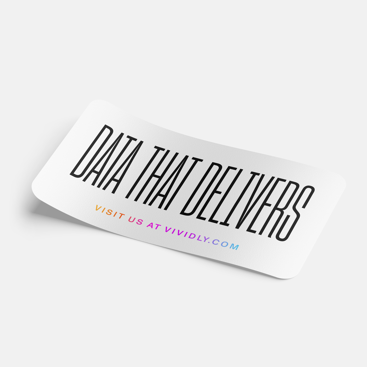
Vividly
Visual Identity, Web Design
My Role: Senior Designer
Creative Direction: George De’ath
Agency: Born & Bred
Year: 2022

Vividly is helping CPG brands illuminate their bottom line when it comes to trade promotions.
-
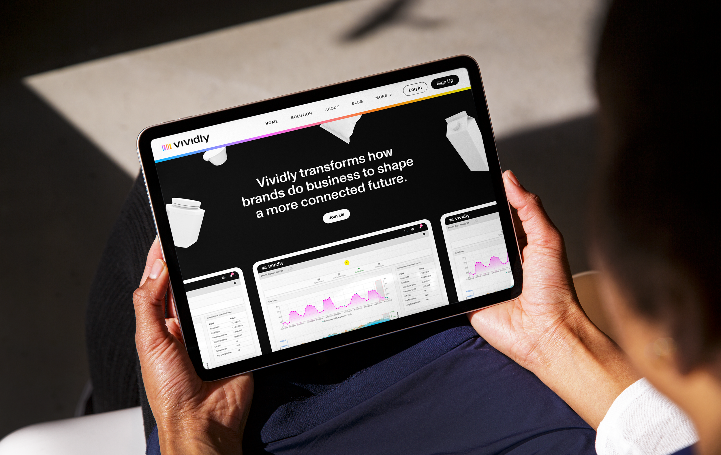
Vividly is a tech company that is transforming how brands do business with tools and insights that save them time and money on trade promotion management. Using AI and machine learning, their software platform is designed to be the most reliable source of trade data. Vividly helps brands plan, track, and analyze their data, freeing them up to focus on growth.
The Vividly team approached our creative team at Born&Bred with the task of aligning their visuals towards something that felt innovative, forward-thinking, and in touch with the modern CPG world. Our teams worked together through discovery sessions and creative strategy workshops to define their larger story and provide a compelling visual identity that told that story from a unique point of view and positioned their brand to appeal to a larger market of users.
-
The result of our collaboration with the team at Vividly was a visual identity system that captured the brand’s story through an imaginative lens.
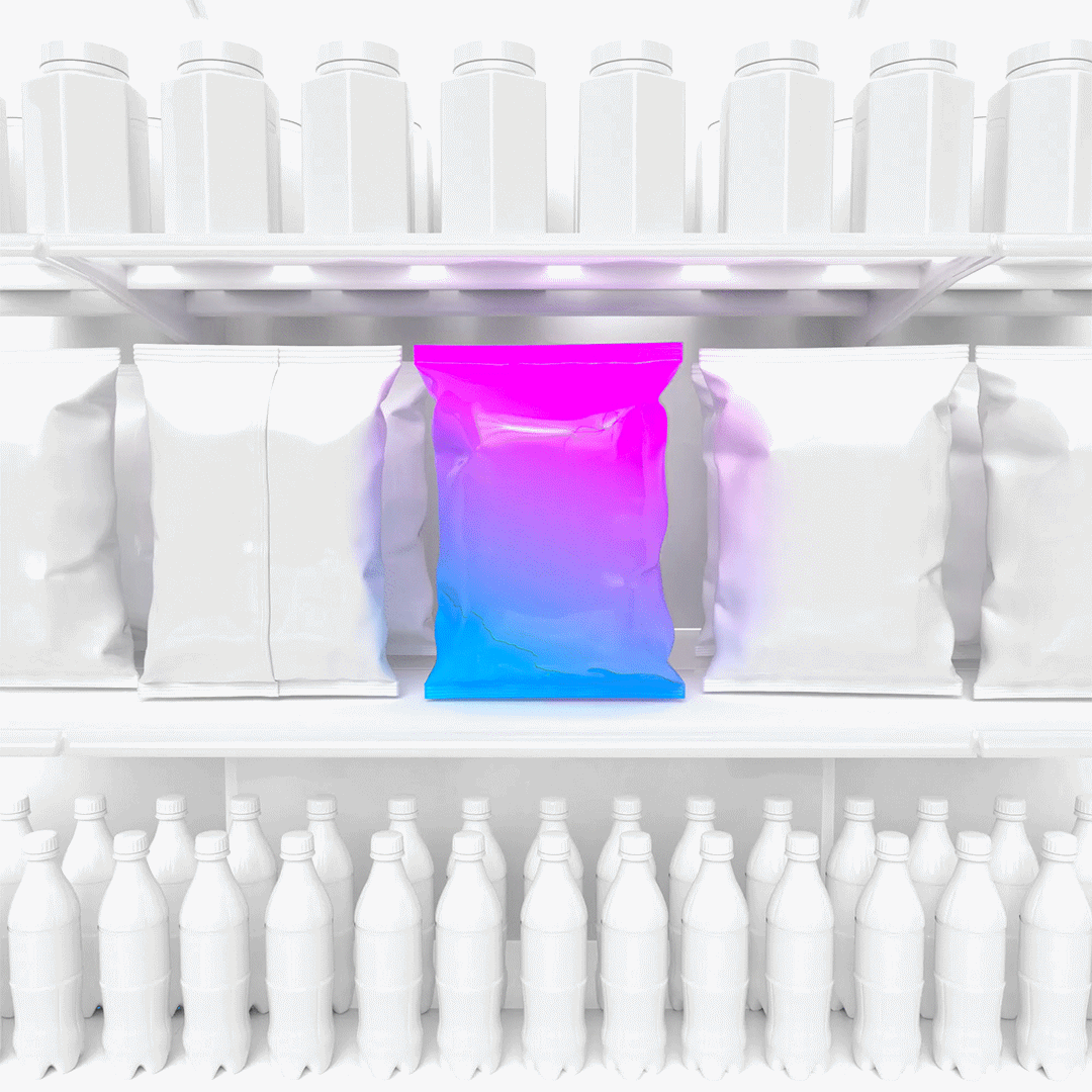
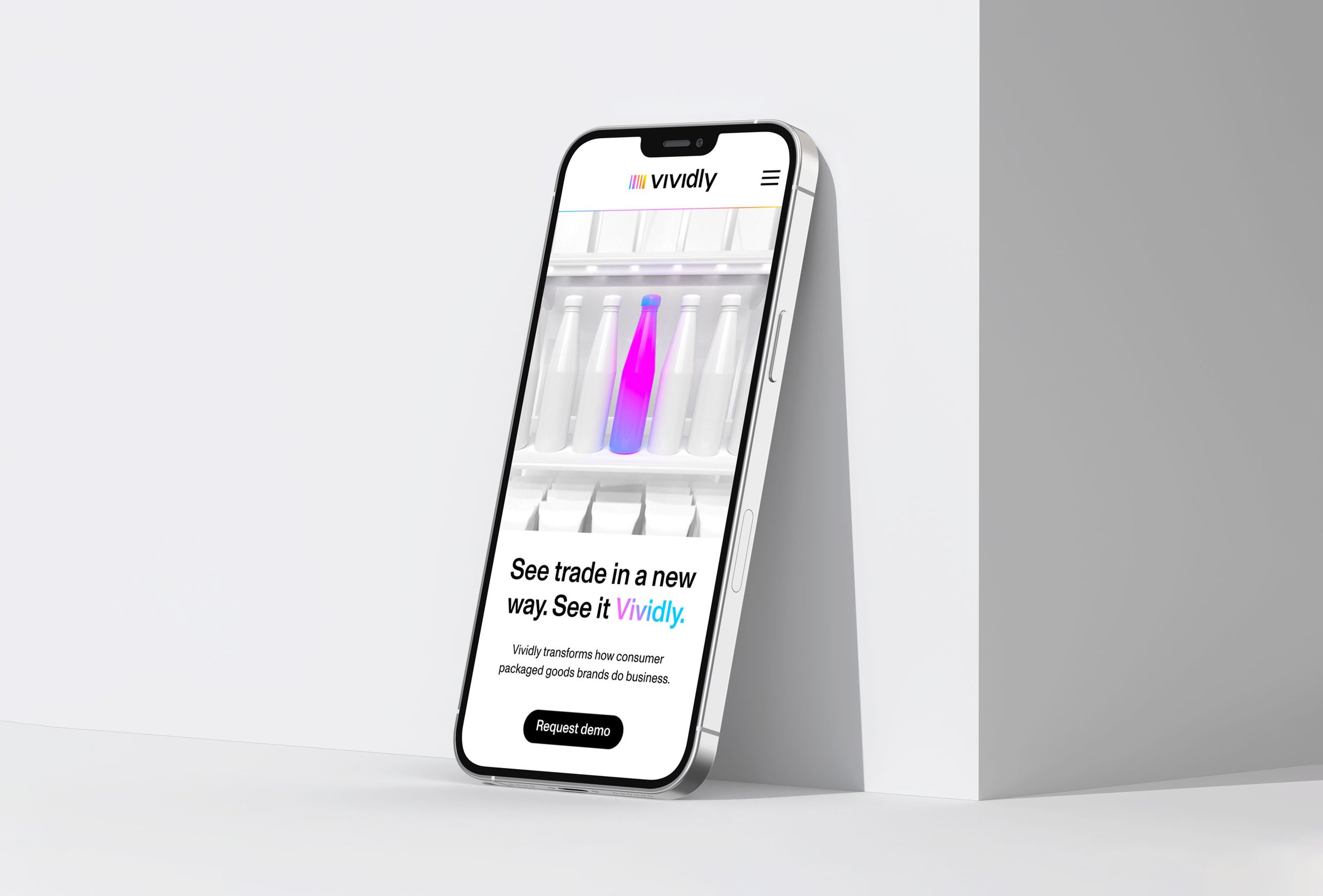
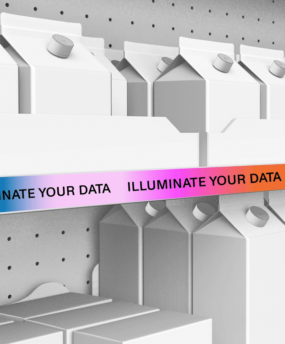
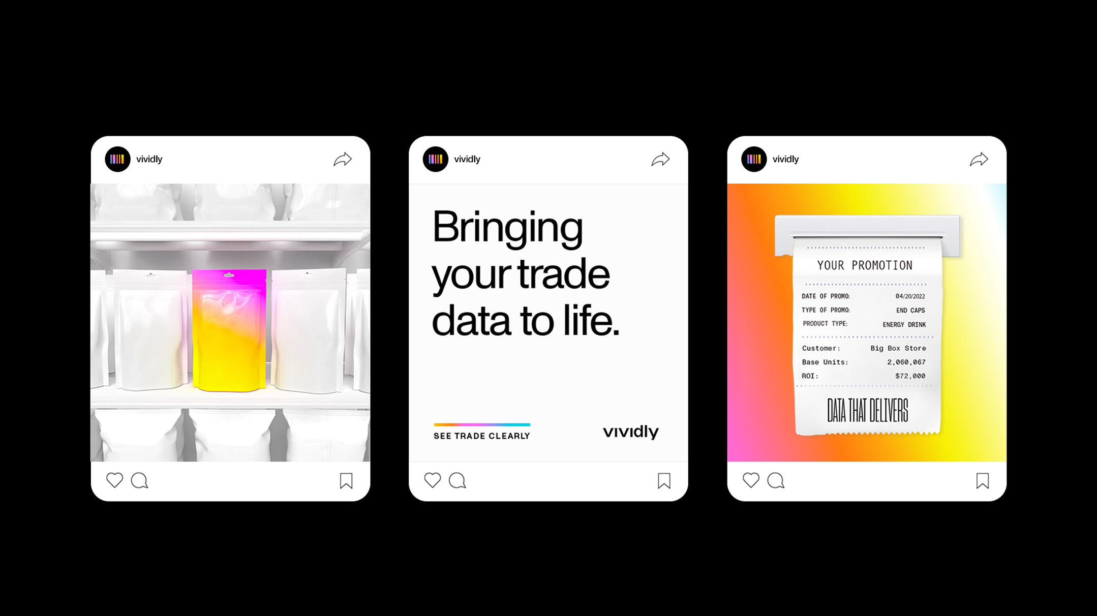
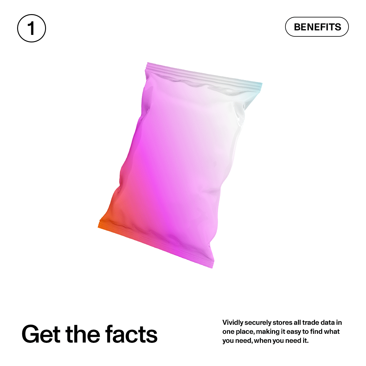
Vividly’s visual identity invites you into a rendered CPG world, where products rest on shelves and become illuminated by the insight Vividly’s product offers. The brand’s rendered graphics bring depth and color to the world of trade by injecting vivid flashes of color and personality into familiar moments from the world of CPG. These renders are used dynamically throughout the system.
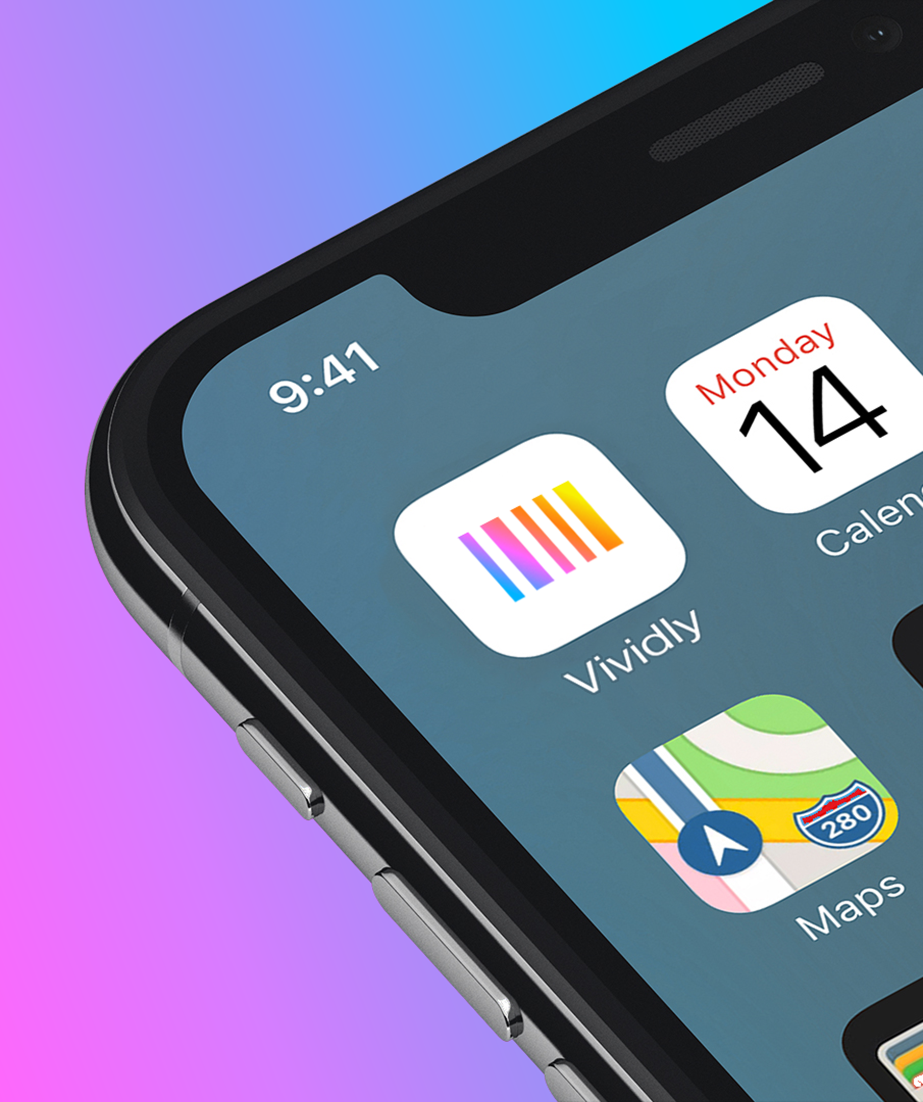
Vividly’s logo lockup tells a story of how the Vividly brand brings color to the world of trade for consumer packaged goods companies. The symbol is a nod to product barcodes and acts as a coded monogram, utilizing the Code 39 barcode pattern for the letter V. The gradient flowing through the symbol illustrates the color that Vividly brings to businesses and their trade data.
The brand's gradient elements were used as a complementary accent throughout the system to show how Vividly illuminates data. The gradients consisted of rich colors that coordinated with various benefits of the software. In addition, the warmth of the color palette intentionally brought a feeling of life to the otherwise sterile and monotone CPG environments. The tension of these two elements captures the colorful insight Vividly brings to brands that would otherwise be overlooked in a sea of monotone CPG data.