Sidekix
Brand Positioning, Visual Identity Design,
Art Direction, Packaging Design
My Role: Designer, Art Director
Production/Product: Rachel Freeman
Photography: Melissa Cave

Sidekix is the brand that’s making unique manicures more convenient than ever.
-
Sidekix is a nail care brand developed by myself and a friend in late 2021. Intending to launch on Amazon, and then later Shopify, we wanted to create a brand that could provide fluidity across platforms.
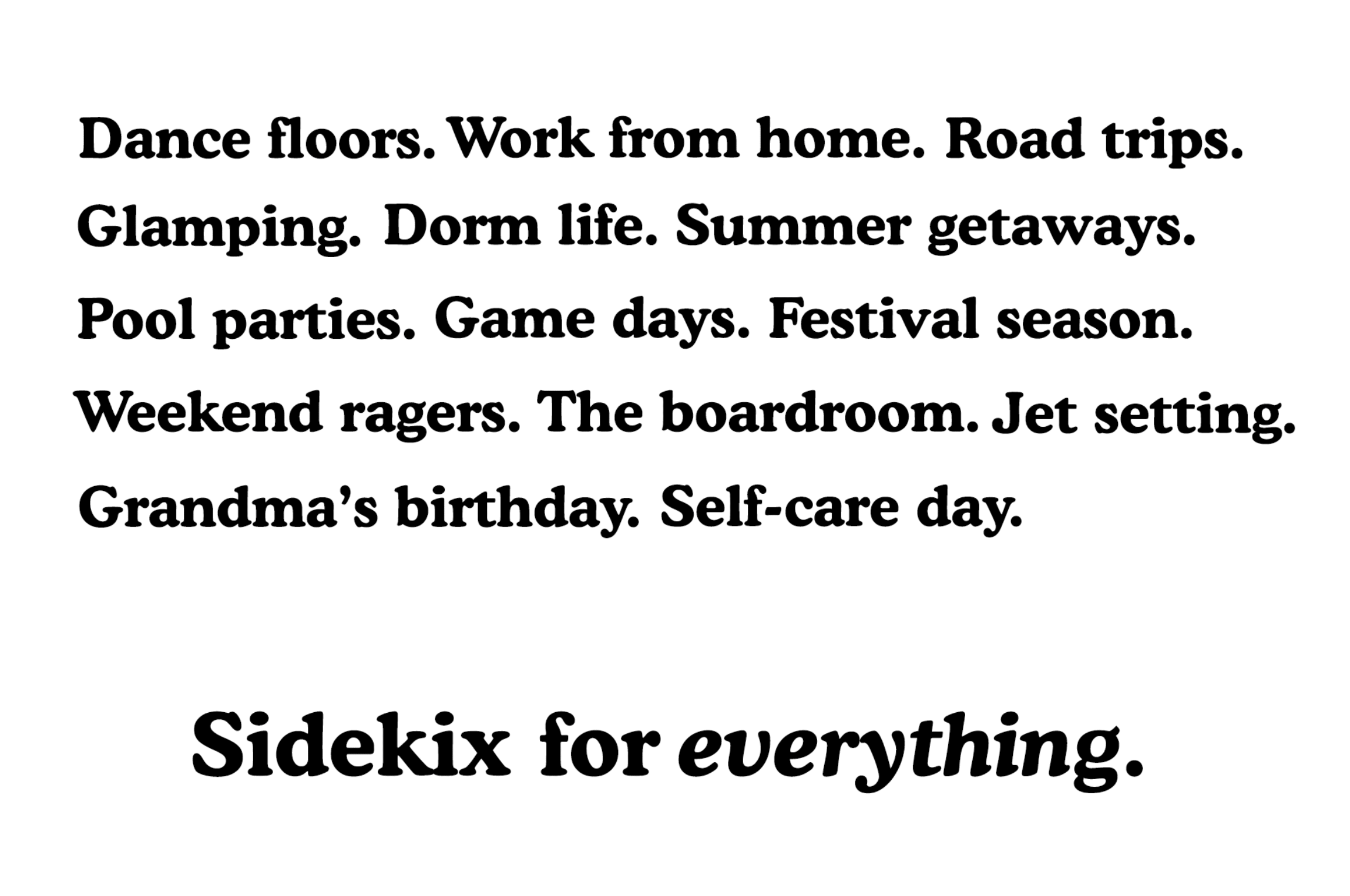
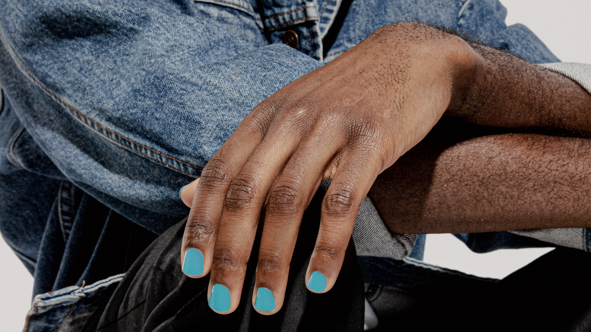
The Sidekix brand sets out to fill a gap in the nail care space where a majority of brands embody a softness and are targeted exclusively toward women. While observing nail care trends we noticed that nail art was making its way into the fashion world for all gender identities and lifestyles. We saw an opportunity to develop the first gender-fluid nail product, targeted specifically at generation-Z. In addition, we noticed that the pandemic had changed consumer attitudes towards expensive and time-consuming nail salon experiences, and we wanted to provide a convenient at-home or on-the-go option. The Sidekix brand needed to be flexible and gender-neutral, while also tapping into the concept of “convenient self-expression” that our product aimed to represent.
To properly test the product in the marketplace, we needed to develop, brand, and launch the idea in under 6 months. So, it was important to create a solid, yet flexible, brand framework that could be expanded on as the brand and product developed further.
-
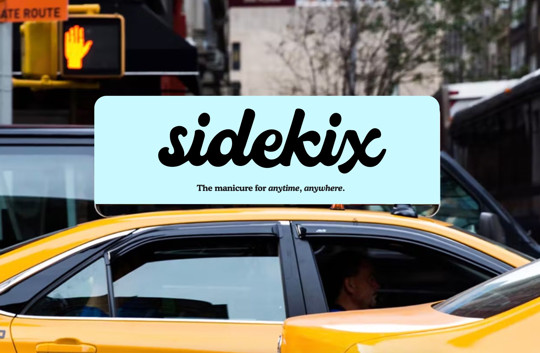
With timeliness and our brand positioning in mind, we developed a brand that felt expressive, flexible, and had a flare of retro inspiration. Inspired by the idea that Sidekix can travel with you in your back pocket absolutely anywhere, we wanted the identity to capture a story that felt active, expansive, and limitless.
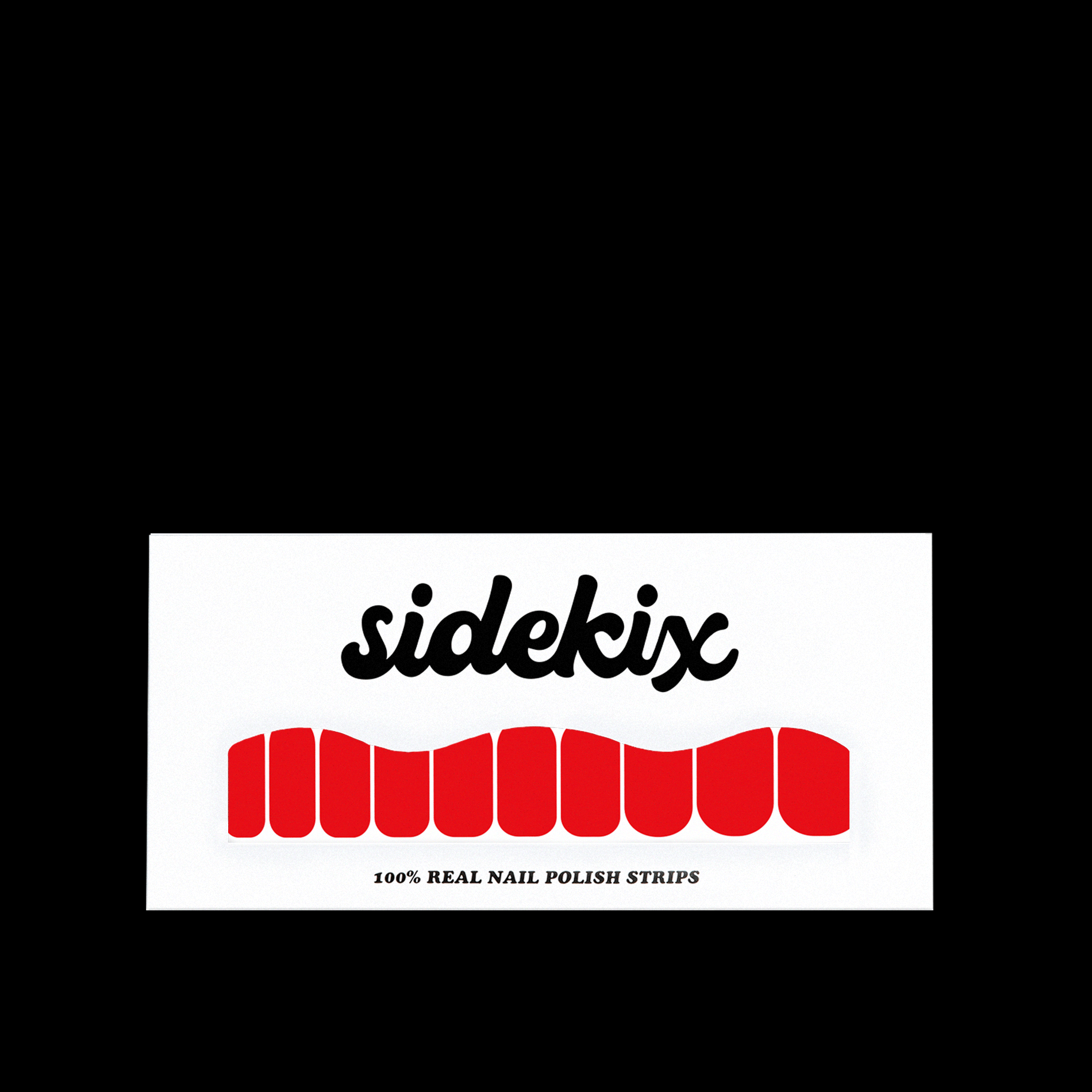
The wordmark, inspired by retro skate & surf culture, gave the brand a “made for all” feeling, while subtly nodding to a carefree and no-strings lifestyle. Likewise, typography played into the retro vibes, with a bold and chunky serif typeface that felt approachable.
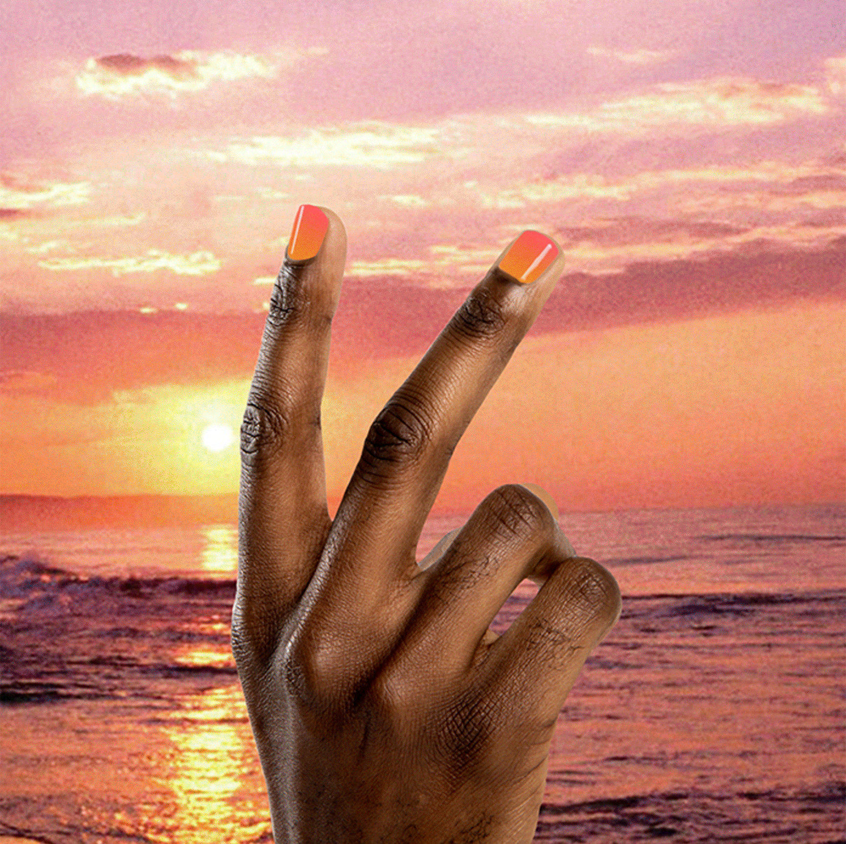
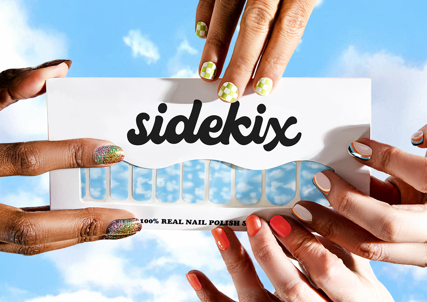
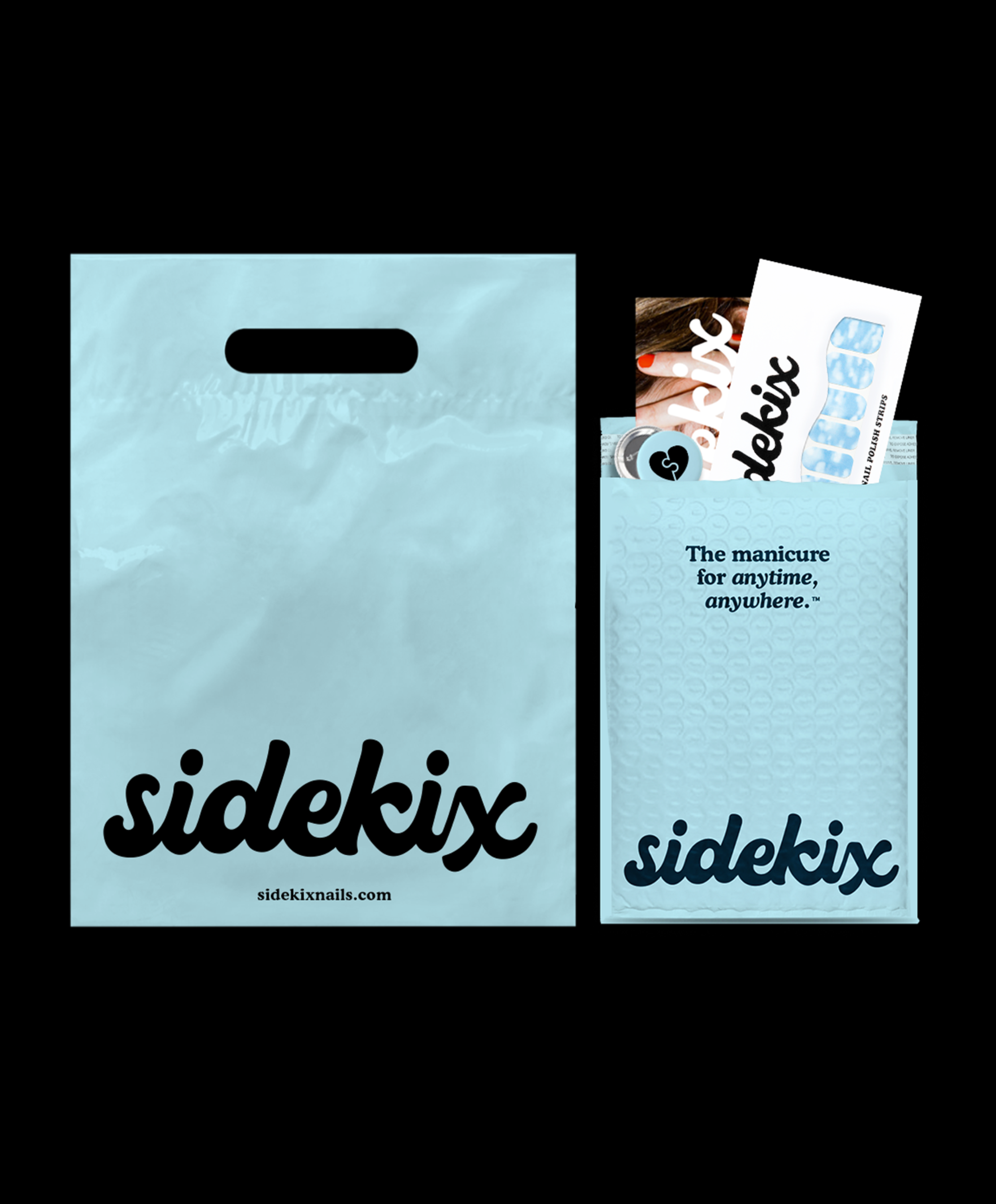
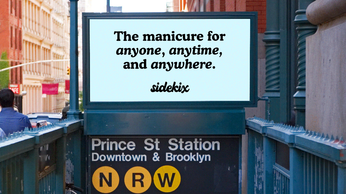
Motifs of hands sporting various Sidekix nail SKUs can be found layered on backdrops of the many places Sidekix can go with you. This acts as a key piece of the visual story and message that Sidekix is “the manicure for anywhere, everywhere”.
The brand photography and camera angles were inspired by 90s hip-hop and lifestyle photography. Utilizing a blank white backdrop, bright moments of solid color were brought through in the wardrobe worn by models and their coordinating nail sticker styles.