EngineEars
Visual Identity, Product Design
My Role: Senior Designer
Agency: Born & Bred
Year: 2021

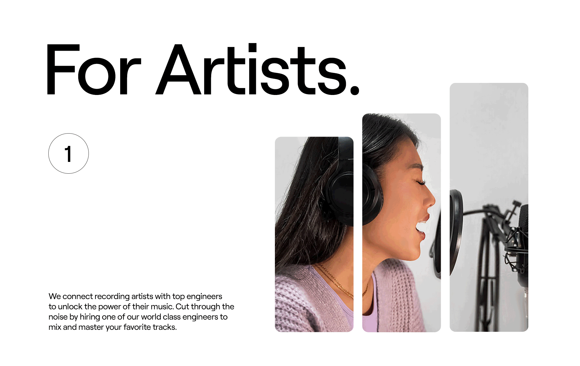
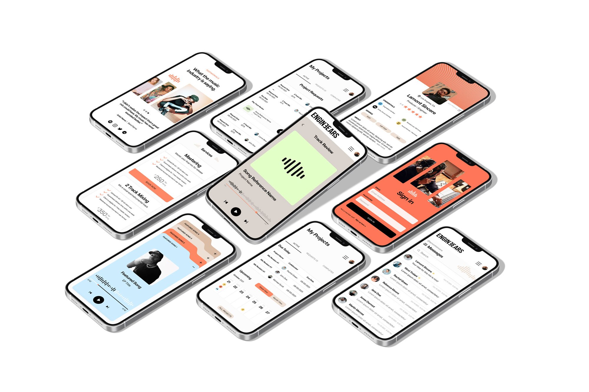
EngineEars is a tech platform where audio engineers and musical artists can come together to collaborate.
-
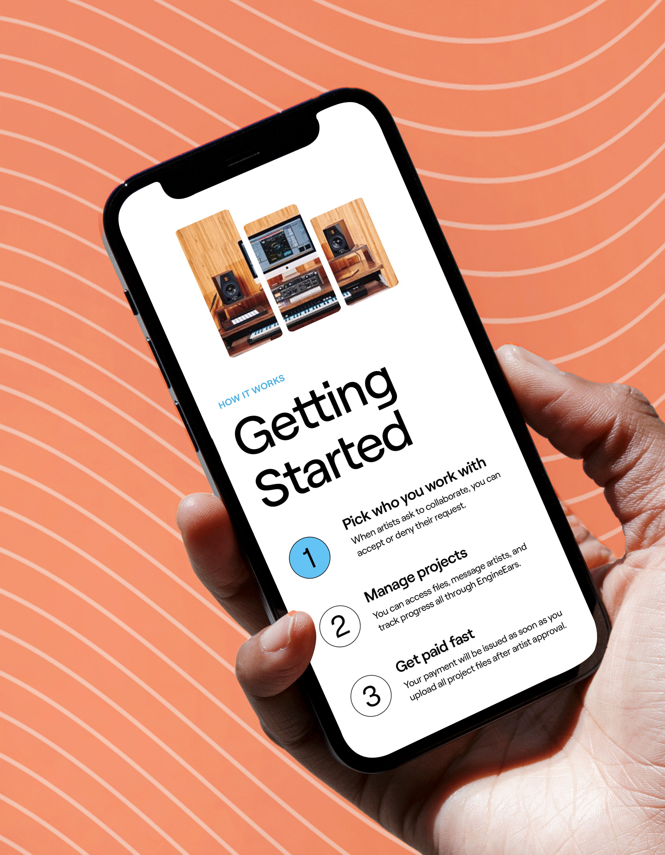
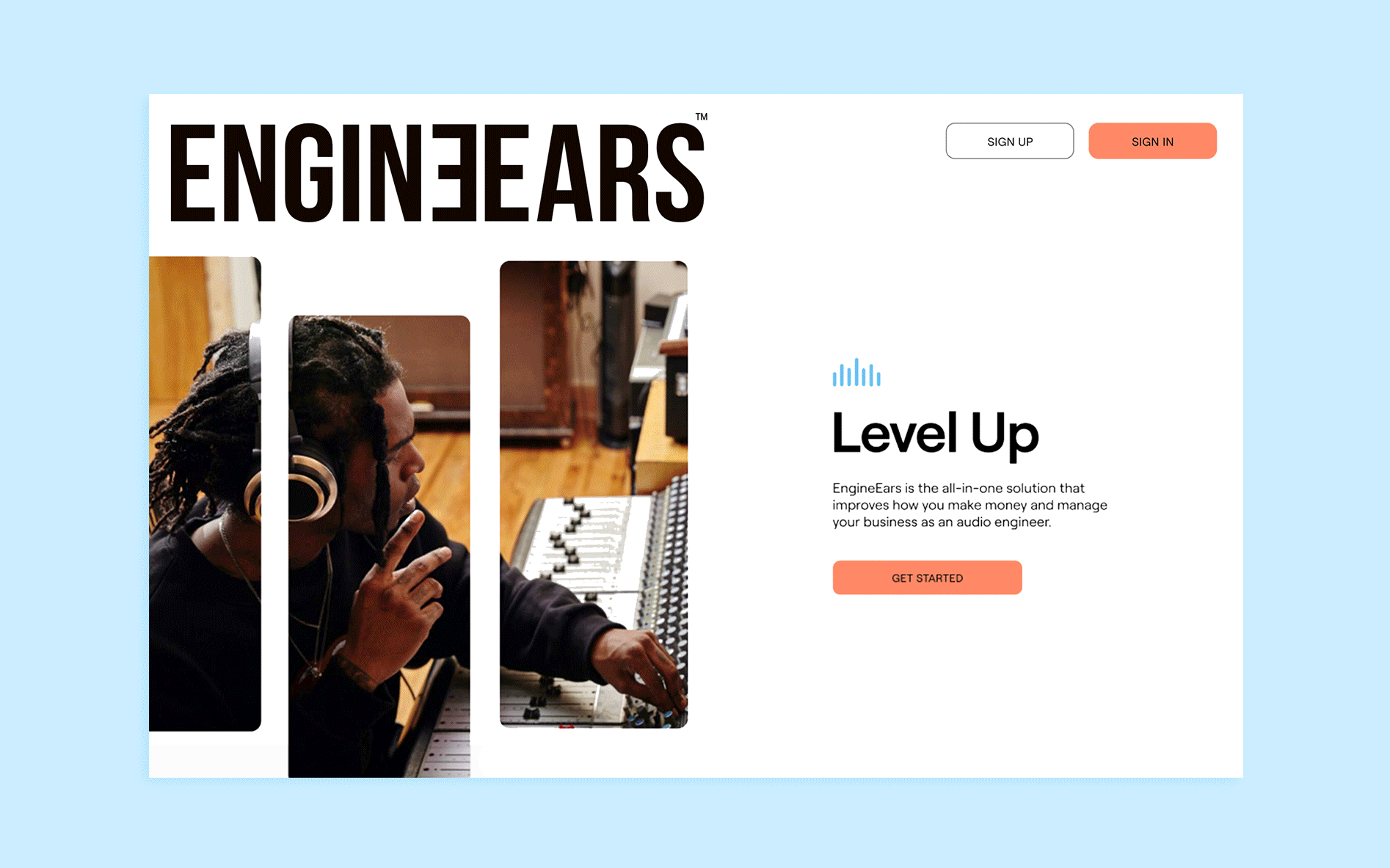
EngineEars is a tech platform that provides audio engineers with the tools they need to operate their businesses. It also enables recording artists, both big and small, to access quality engineering services around the globe. Founded by Grammy-winning audio engineer, Derek Ali, the company hoped to move its product out of beta mode and re-launch the platform to its greater music community with confidence.
Our key objective was to refresh EngineEar’s visual identity with an emphasis on how it could translate to their digital platform. In addition, the EngineEars team hoped to re-launch with a look that could appeal to a larger market and provide a visual story that aligns with the up-and-coming music industry.
-
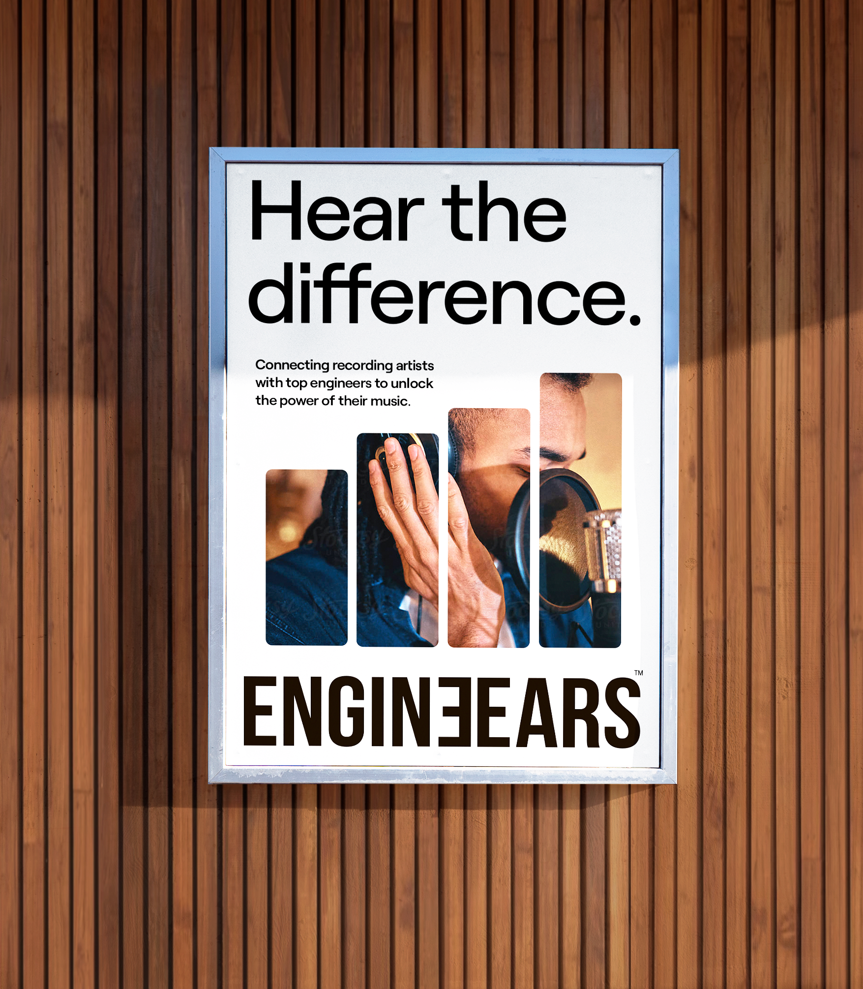
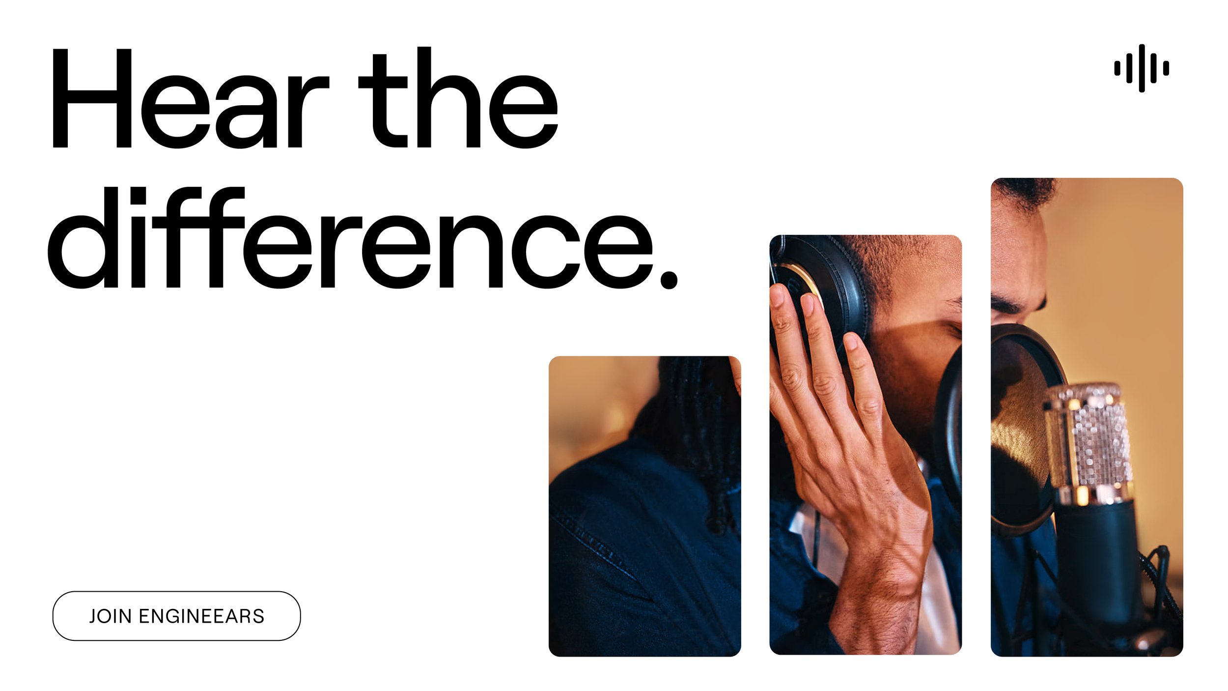
The result of our time working with the team at EngineEars was a visual identity re-fresh that felt modern, and fresh; capturing a sense of openness and possibility. Inspired by both the technical nature of the engineering process and the warmth of a retro recording studio, we developed a brand system that felt aspirational and attuned to the future of music development.
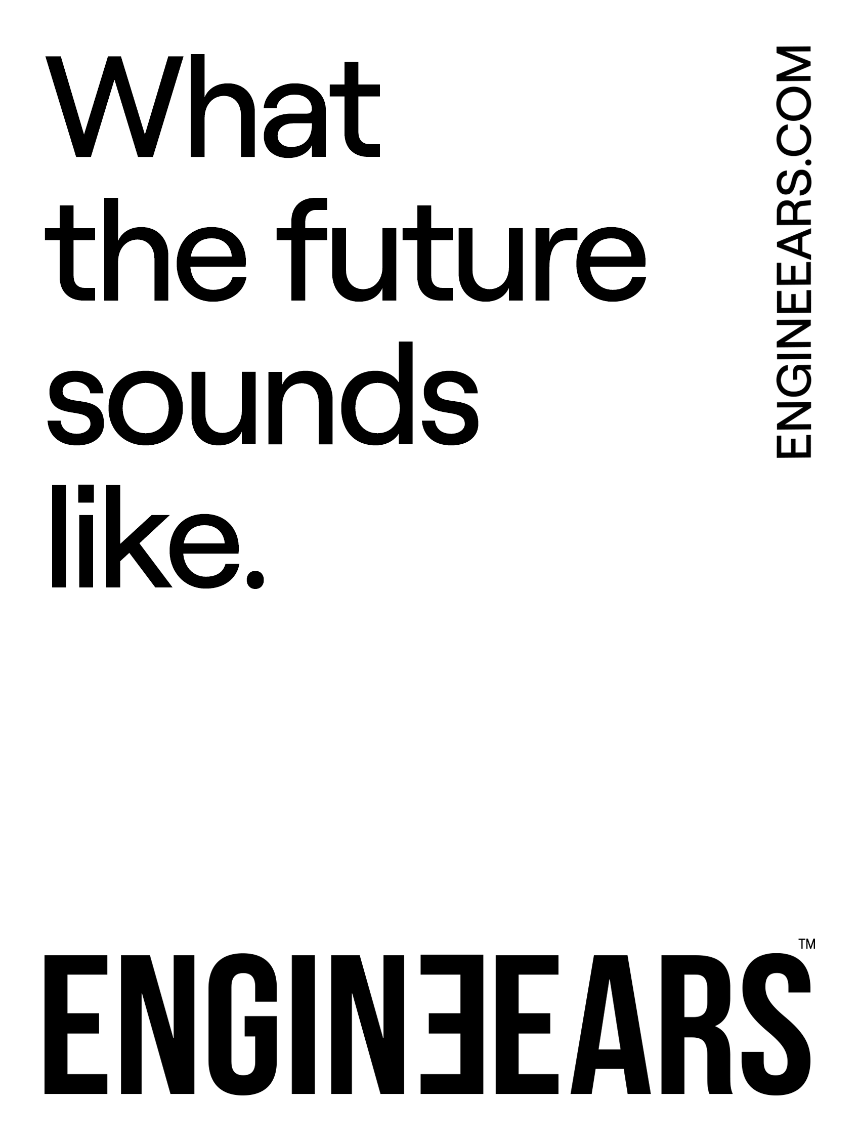
The overall brand gives the feeling of an open space, where every artist and engineer’s creative flow is sparked. Within this open space, the messy parts of your hustle are handled and all you have to focus on is creating the next amazing hit. This feeling of calm was demonstrated through clean and modern typography utilized in spacious whitespace throughout the brand. This gave the digital and brand creative an open and sleek experience, giving users trust in both the benefits of the product and the possibilities it provides. Likewise, The brand’s word mark was refreshed with clean and condensed letterforms, connecting to the feeling of expansion and creative confidence.
For inspiration around the symbol, brand patterns, and image cut-outs, we looked to the audio engineering process. We studied the visual language of audio engineering software and the variety of sound stems and waves one would see arranged on an engineer's laptop. This concept came through with a sound wave symbol that dynamically animates, illustrating the various sounds an engineer would mix and master. The brand system also extends this motif to the utilization of dynamic sound wave cut-outs for brand imagery. The brand's pattern system provides a more artful take on sound waves. The brand patterns showcase a variety of energetic and fluid motifs. The visual emphasis on soundwaves for these brand elements adds another layer to the identity system and celebrates the audio creations themselves.
Overall, the EngineEars re-brand embodied a fresh and culturally relevant visual language that translated to the brand’s product, its website, and any OOH applications. To bring more opportunities to creators in the music industry, their updated look provides an open space for new music to be born.