Butterfly Superfoods
Brand Identity, Art Direction, Web Design
My Role: Designer, Art Director
Creative Director: Willow Hill
Agency: Scout Lab
Year: 2019


Butterfly Superfoods is simplifying the path to nourishment.
-
Butterfly is a new kind of nut butter company that’s providing an approachable path to wellness. Their debut product—four nut butter varieties—includes delicious flavors that can be eaten with any meal. Not to mention they are fully Keto, non-GMO, and paleo-friendly.
Our creative team was challenged with the task of strategically leveling up Butterfly’s brand, making it a delectable, approachable, and down-to-earth staple in everyone’s pantry. Also, to prepare the brand for its upcoming placement in organic markets such as Erewhon and Whole Foods.
After weeks of strategic discovery sessions for the brand, we got to work on exploring various avenues the brand could go down conceptually regarding its packaging, website, and art direction. The goal was for the story to resonate with a family-friendly crowd, but with a spin of humor that gave it true personality. -
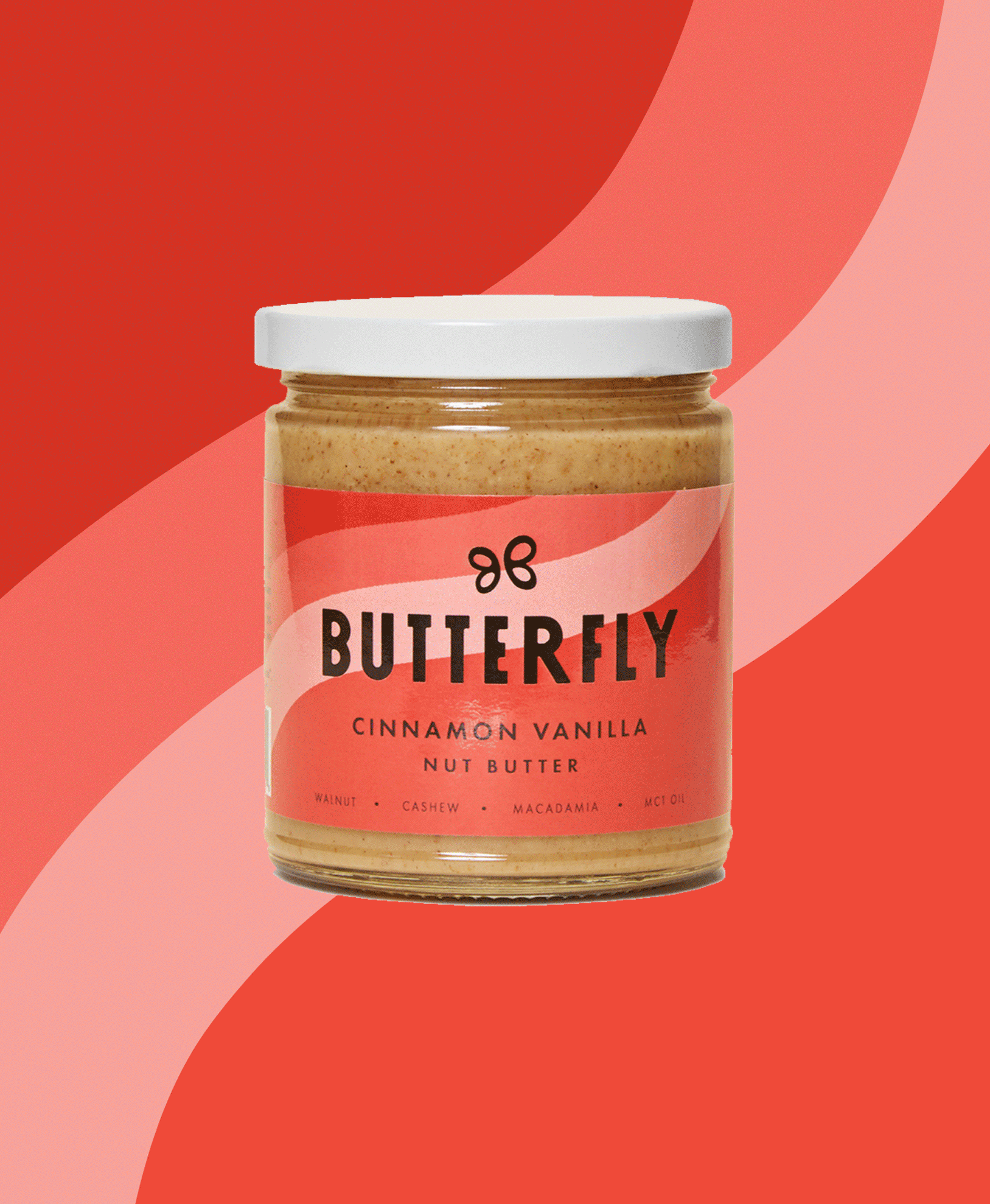
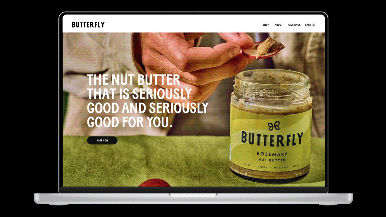
The result of our time working on the Butterfly brand was an identity system that felt wonderfully sensorial, with delicious butter drips and buttery waves occupying the packaging, and graphic treatments. We wanted the sensory experience of the product to be palpable througout the brand.
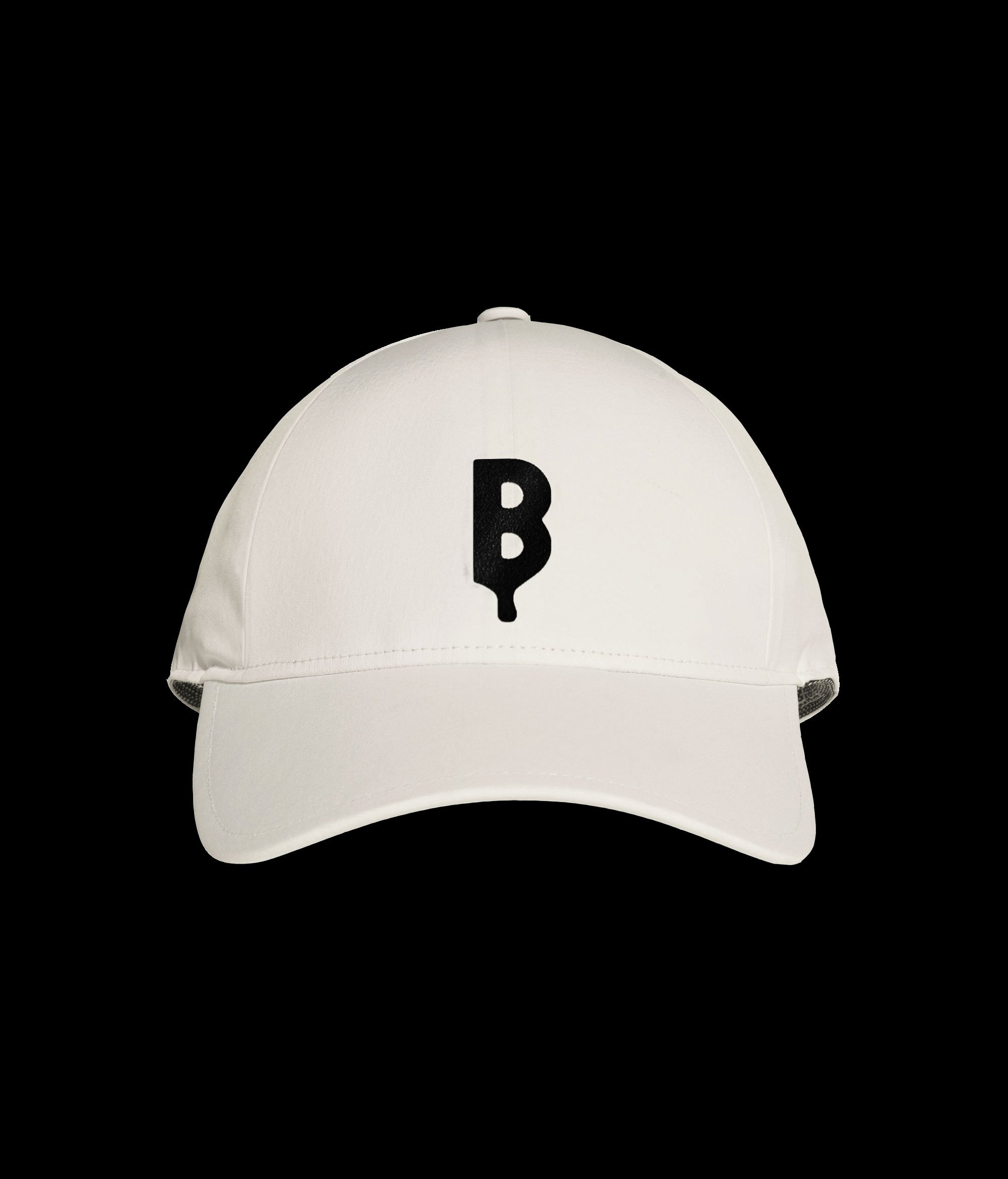
The brand’s wordmark and typography feature friendly and condensed letterforms that make the type approachable and scalable. Moments of charm were added to the type with animated butter drips forming from the bottom of letterforms — a sensorial touch. The brand’s symbol was used as somewhat of a secondary mascot for the brand, with its formation consisting of two reflected Bs making a buttery butterfly. This symbol was used as a subtle stamp on the packaging experience, and in smaller digital instances.
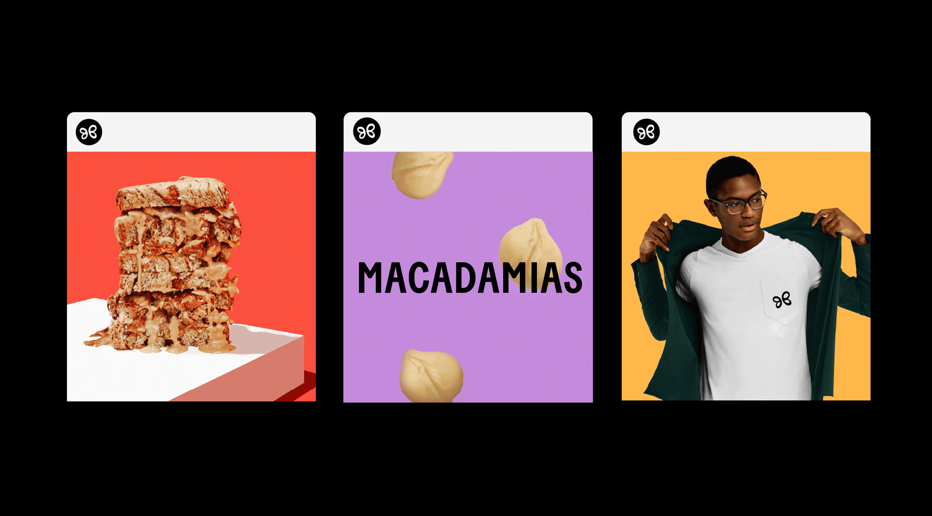
Butterfly’s friendly nature called for moments of hand-drawn charm to compliment the condensed and blocklike typography used through the system. As a solution, iconography and any small descriptive illustrations were created with a handmade touch — giving the brand another touchpoint that felt tactile and attuned to the senses.
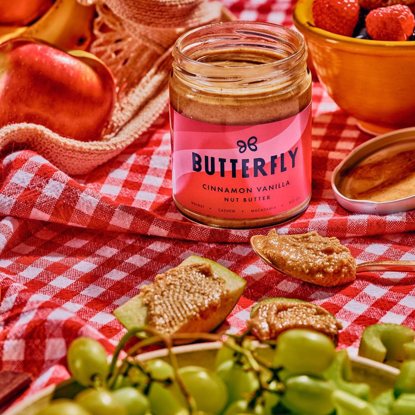
Brand photography emphasized scrumptious shots of the butter product itself and various lifestyle applications. The photography is warm and approachable — as if you are in your best friend’s kitchen getting a nice snack spread prepared or packing for an afternoon picnic.
Overall, Butterfly’s brand provides a lighthearted visual story that, honestly, makes us all a little hungry.
Butterfly successfully launched in February 2020 and has been sold in retailers such as Erewhon and Whole Foods.