Vanity Fair
Art Direction, Digital Design
My Role: Art Direction, Styling
Photography: Raj Shah
Client: Condé Nast
Year: 2018

Creating a monochromatic digital campaign celebrating the release of Vanity Fair’s 24th Hollywood Issue.
-
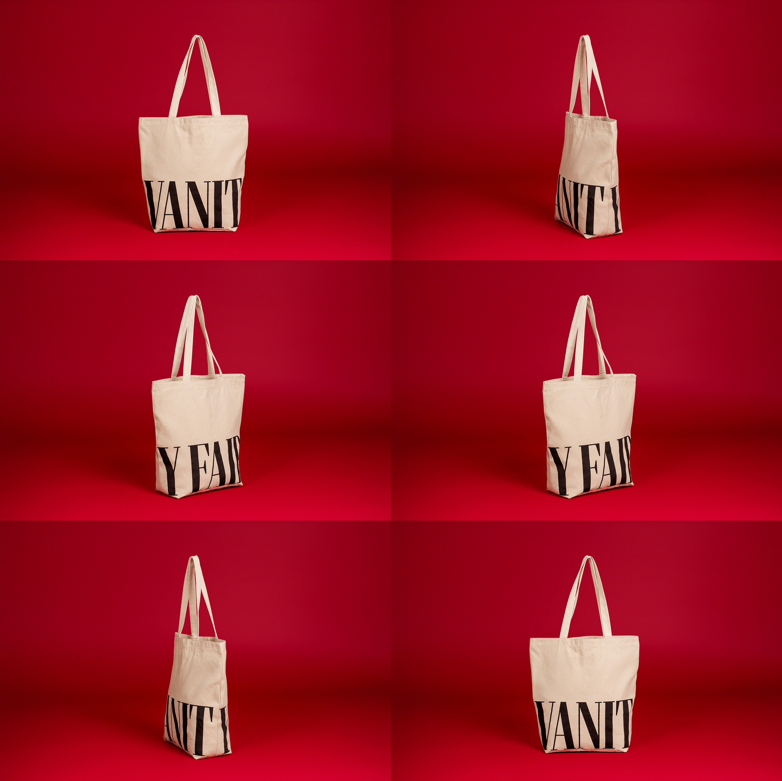
Vanity Fair is media publication that has always been known for high-profile interviews, stunning photography, and thought-provoking features. For a digital campaign celebrating the release of their 24th Hollywood issue, my creative team at Condé Nast was tasked with producing and art directing a hero image that highlighted the publications Hollywood reporting, while also promoting the branded tote bag that is gifted to anyone who subscribes to Vanity Fair’s content.
This photo series was to be used as sponsored creative for ads across Instagram, Facebook, and various Google ads in an effort to acquire new subscribers. -
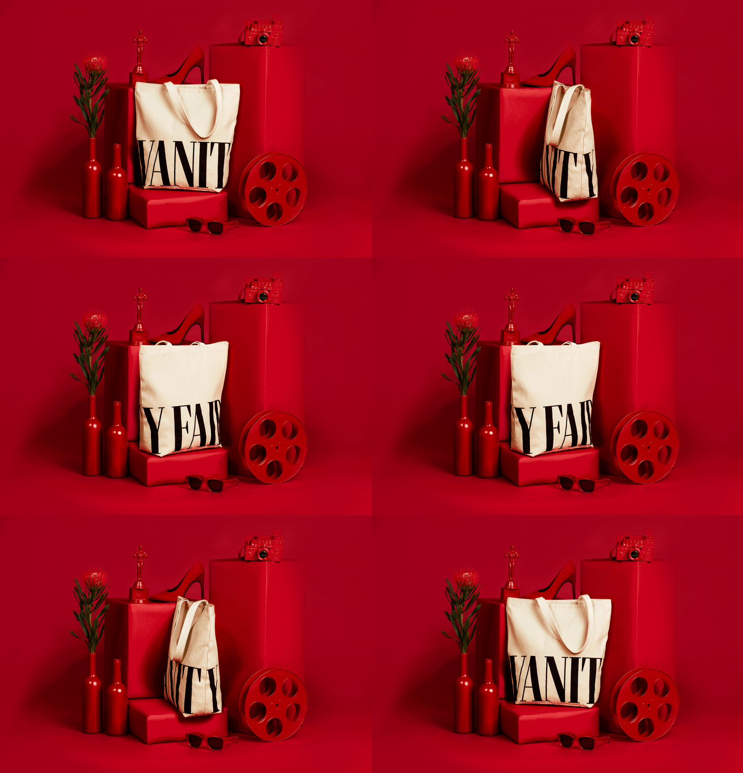
The photo series provided a conceptual motif of objects surrounding a branded tote featured in an all-red monochromatic environment.
Each object in the photo represents the, thought-provoking, point of view Vanity Fair has on Hollywood. The red set design alludes to the red carpet — a bold scarlet hue that evokes feelings of power, impact, and prestige.
We created a hero image that not only told a story about Vanity Fair’s content, and journalistic prowess, but also provided an eye-catching scene that would stop the thumbs of potential subscribers.
This ad ran in the Fall of 2018 across multiple social media platforms.


