Spktrm Beauty
Brand Strategy, Brand Identity, Art Direction, Packaging, Web Design
My Role: Senior Designer, Art Director
Creative Director: Willow Hill
Photography: Fiona y Eduardo
Agency: Scout Lab
Year: 2018

Spktrm is the beauty brand that is disrupting all of the industry rules.
-
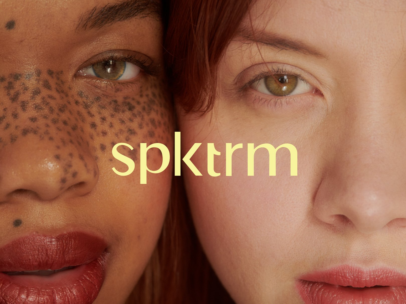
What’s the new wave in beauty? Unfiltered. There’s a wave of brands making an effort to promote real, eclectic beauty that mirrors the world we live in. Yet, images are still manipulated, even though the depiction of beauty is widening. Enter Spktrm Beauty, a beauty brand my team and I helped re-launch in 2019, whose mission is to throw all these standards and limitations out the window.
The objective of our re-brand with Spktrm Beauty was to capture a visual story that felt more aligned with the future of our beauty narratives and had a futuristic edge. In addition, we aimed to create a visual world through imagery where inclusivity is celebrated. -
The result of our re-brand with Spktrm Beauty was a future-forward brand system created upon a foundation of inclusiveness to all forms of beauty and gender identifications.
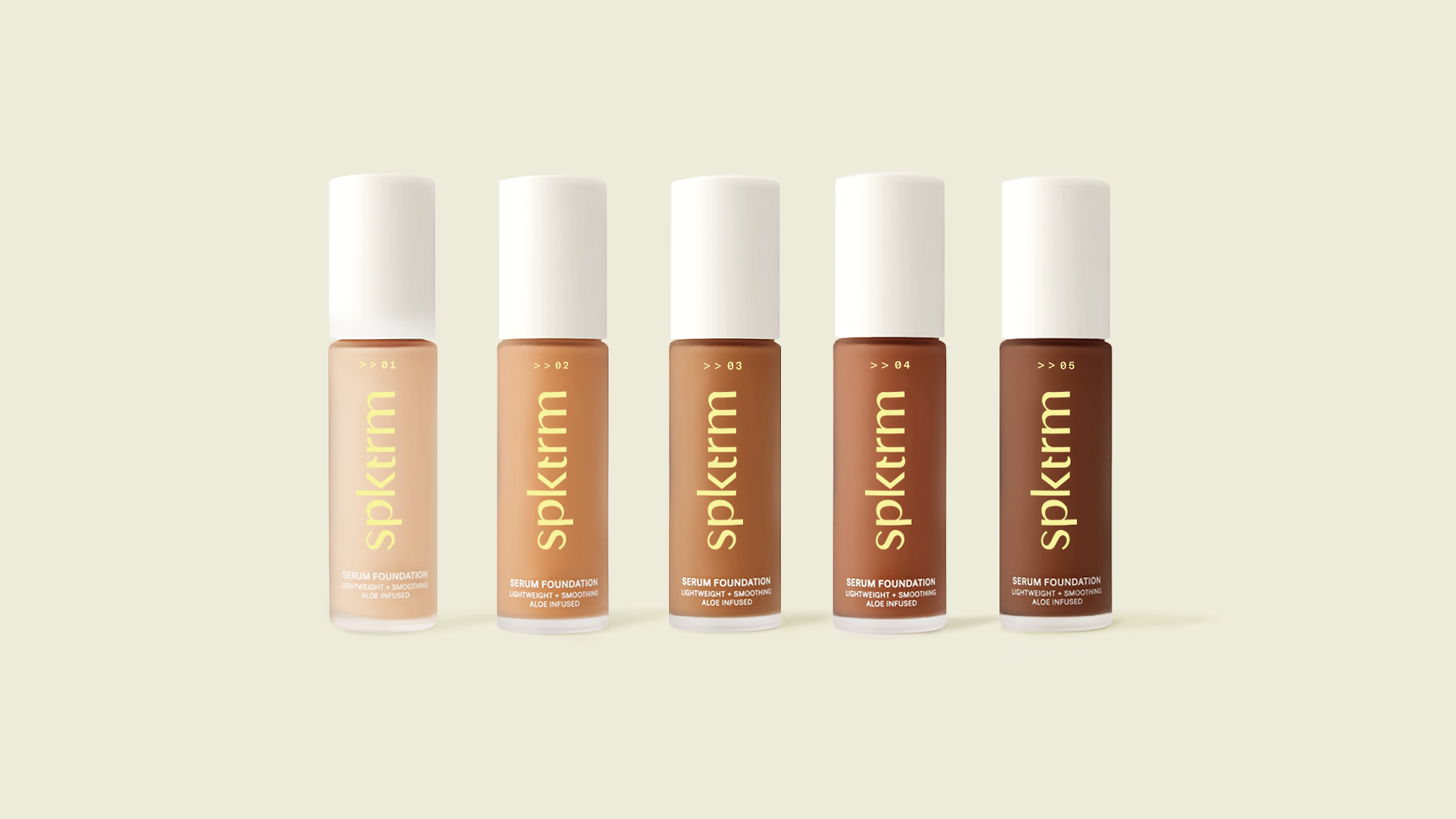
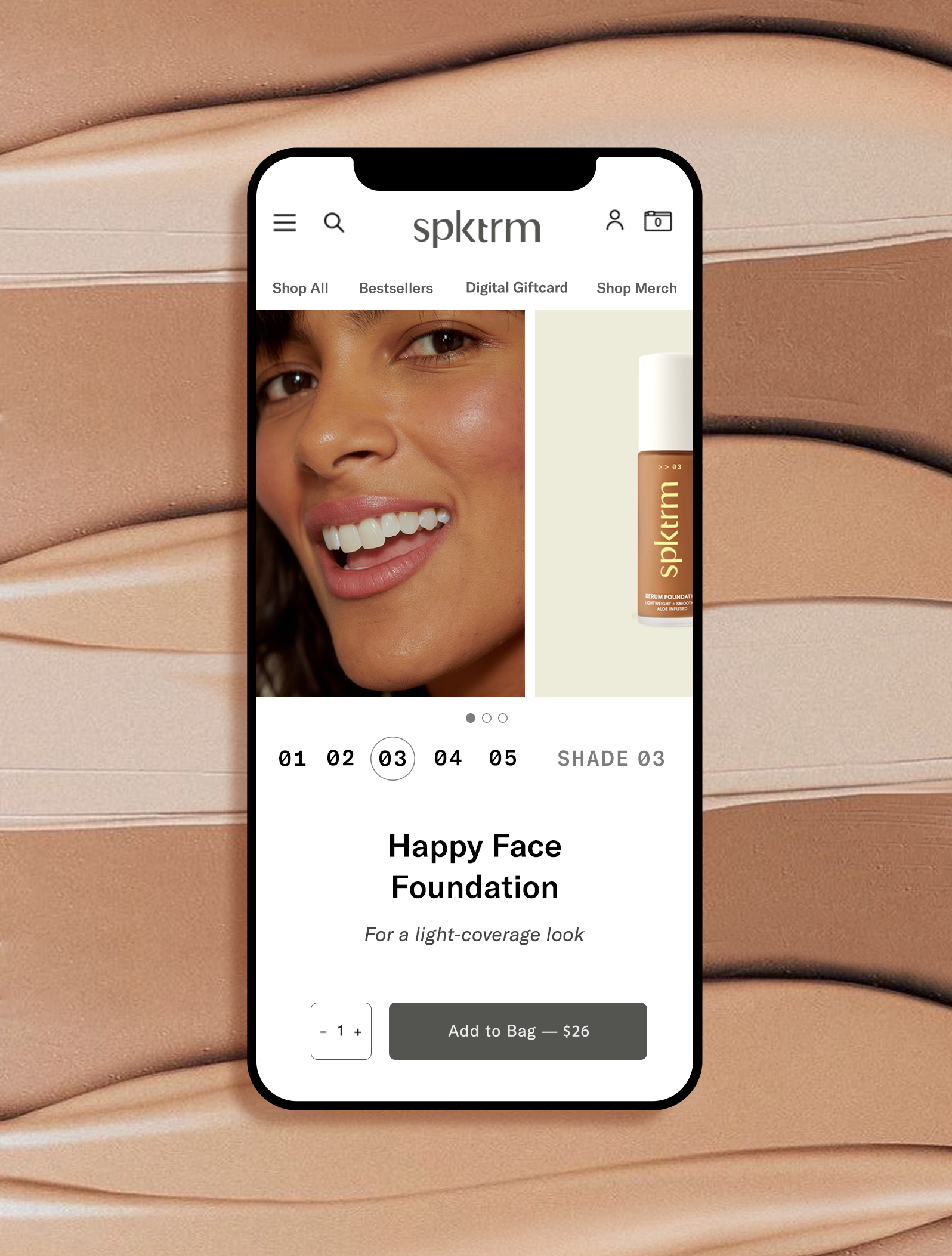
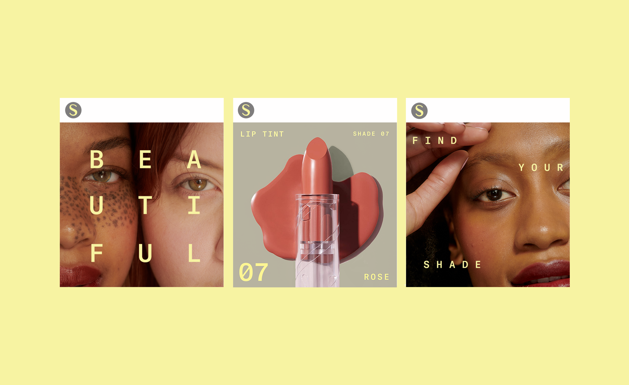
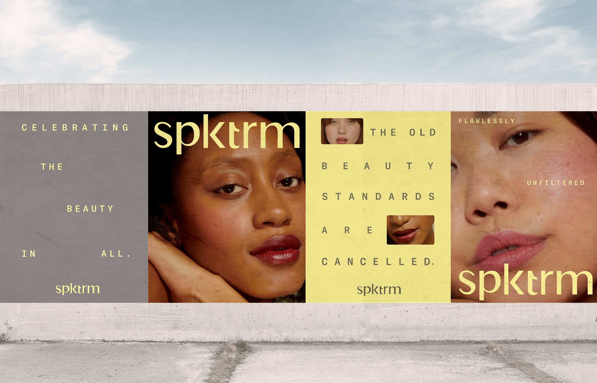
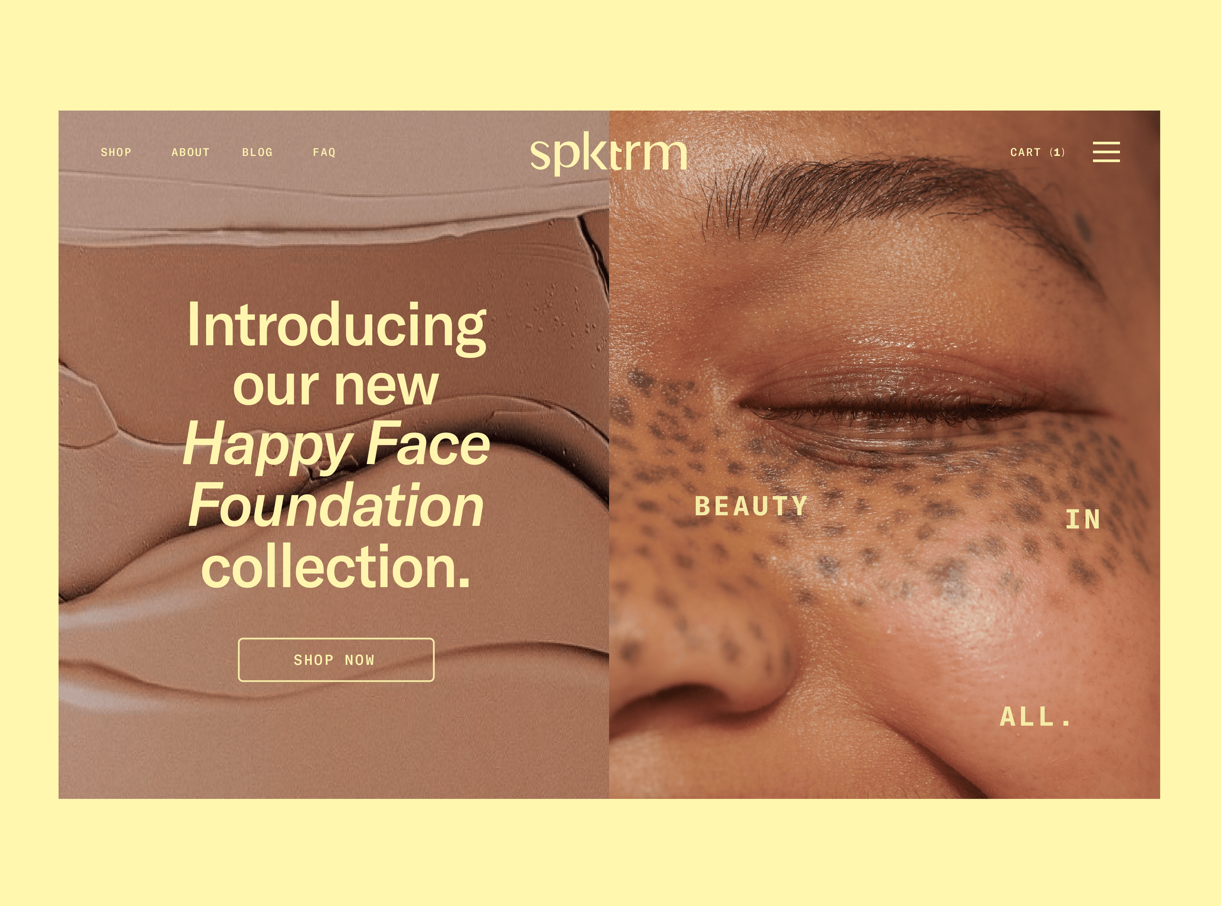
The over-arching concept of the re-brand was to create a system that explored the idea of a spectrum and the flexible nature of beauty narratives. Beauty, skin shades, personalities, and personal stories can differ in ways that are equally beautiful and important. To showcase this thinking, we created a dynamic wordmark with a hidden arrow connected to the “k” letterform. The arrow can animate to showcase the flexibility of Spktrm and its commitment to pushing the narrative around beauty forward.
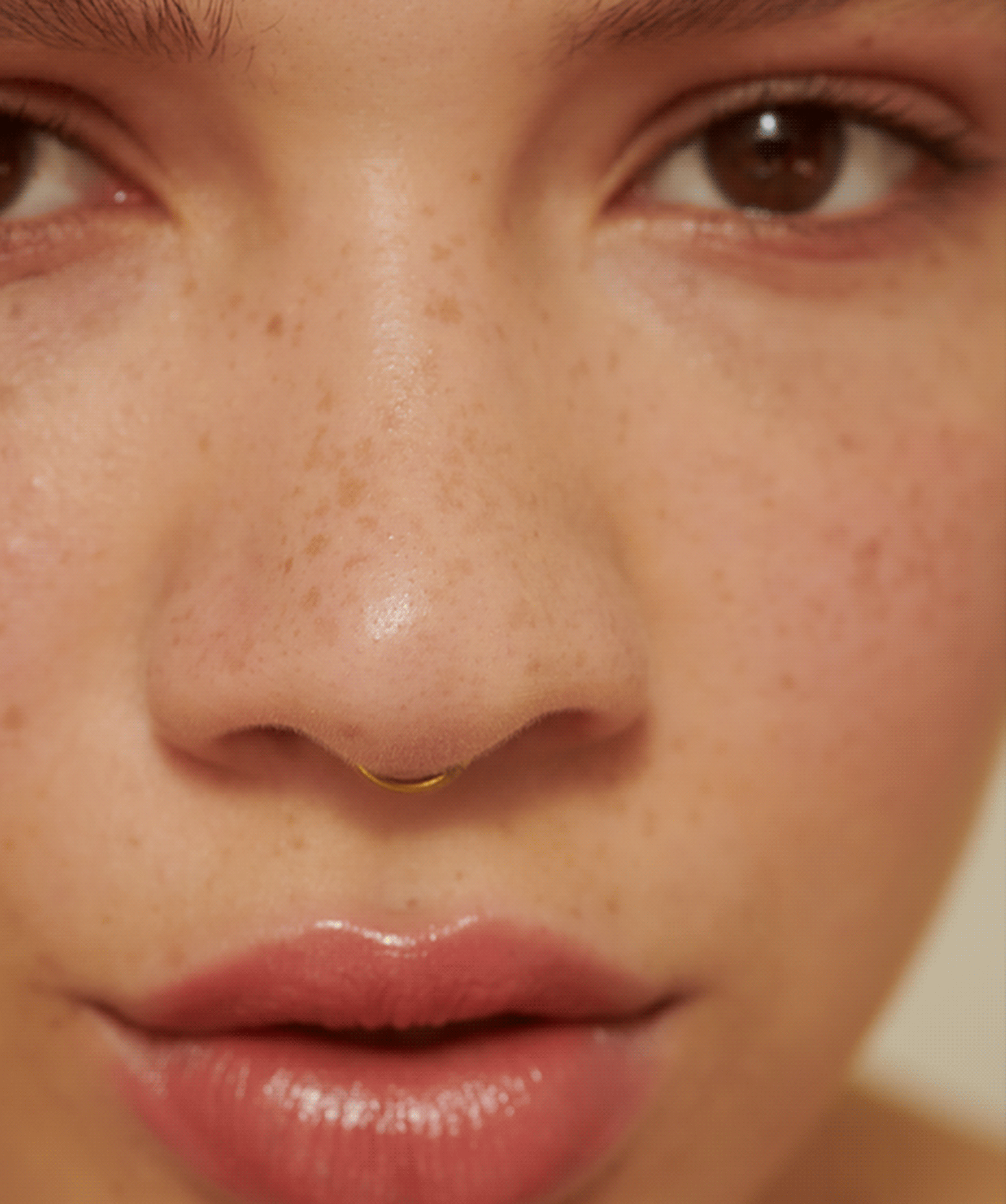
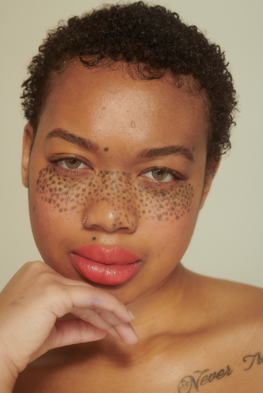
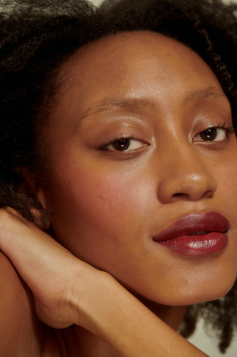
The design system uses typography as a tool to tell the brand’s story of flexibility and differentiation across all brand touchpoints. The type is found in a futuristic mono typeface that makes the brand feel innovative and pioneering. The typeface appears innovative as if Spkrm is writing code for the future of beauty. Letterforms can be found stretched with different leading and positioning across all brand collateral and touchpoints demonstrating the beautiful points of differentiation between very human.Brand photography is unfiltered, un-retouched, and shot in soft neutral lighting. The imagery highlights the gorgeous and distinctive features of each model, making their unique attributes the most beautiful thing about them.
Sadly, the Spktrm Beauty brand was one of many brands that did not survive the impact of the pandemic and it closed its online doors in 2020. However, the identity we created still holds a special place in our hearts and the message of the brand is still one to be shared and hopefully replicated by beauty brands to come.